Showing posts with label #SetUp. Show all posts

Sunday, 19 April 2015

Street Photography

As part of my photography project I had to include some street photography, so I decided I wanted to do a fashion shoot with an urban twist. These are some of my older work but still a good example of street photography. I had taken these photos in a car park and as I was using natural light to take these photos I had the challenge of working out how I was going to get my photos well lite without having to use a longer shutter setting. I had worked out that if I went to the location early in the morning with my model then the sun would rise letting lots of light through the open gaps.
I did some experimenting with the settings for each photo so I'll put the setting I used under the photos below.

6.3mm
1/80
f/3.8
ISO 400

6.3mm
1/80
f/3.8
ISO 400

5mm
1/60
f/3.4
ISO 800

4.3mm
1/60
f/3.1
ISO 250

7.8mm
1/60
f/4
ISO 640

My photos were taken on my Fuji bridge, handheld as that was the only camera I had at the time and I didn't own a tripod. Hope you like them :)
Question of the day: Do you prefer fashion or urban photography??

Friday, 17 April 2015

Could This Be Magic??

I smell another late weekly challenge, well this challenge was closely related to levitation; magic. I used the same technique as my levitation photos, I came to realise for this task that photographing magic isn't as easy as I thought it would be. I thought of lots of creative magical looking images in my head but with limited resources it was hard to do what I wanted.
Here's 3 of my favourite magic images.


Question of the day: What creative ideas would you have used for magic photography??

Thursday, 16 April 2015

Just Falling Through A Different Universe

So as part of my weekly challenges I was set the task to create a levitation image. This was something I was pretty excited to do, so I thought I'd make a tutorial of how I did it.
So to start with I took my images (it's best to take your photos with a tripod to keep the camera in the same place), one background image and one image with the subject in. For each time the camera moves you have to re-take the background image, this is because you want the background to match the photo that with be sitting on top.


So these are my starting two images that I will be editing.

I started by opening both images in photoshop, drag the subject image over the background.

Next you need to click on the easer. 

And start rubbing out the excess you don't need.

Don't forget, to make it look more realistic rub out the shadow too otherwise the effect of the levitation doesn't look as real.

This is my final image, it looks like my model has just come out from a different universe. 


Here's another two that I did. Hope you found this helpful and enjoyed as much as I did. 


Friday, 10 April 2015

Pseudo-HDR

As part of my weekly challenges at uni I was told to photograph HDR (High Dynamic Range). This has definitely proven to be a challenge for me therefore I have taken a cheat way of creating HDR (this technique is also known as Pseudo-HDR). The difference between the two is Pseuedo-HDR is created using a single frame whereas HDR is a combination of 3 frames: 1 regular exposed image, 1 over exposed and 1 under exposed. While I work on getting HDR done properly I will give you a little tutorial on how I achieved the Pseudo-HDR.

Starting point: this is the image I will be using. It is just a normal exposed image I took while on holiday last year.

So to start off I made a duplication of my image. To do this I right clicked on the background image. You can name the layer whatever you see fit, I decided to keep my layer as just 'background copy'.

Once you have made the duplication click on the drop down box, then go down the list and click on 'Overlay'. I circled them off in the image above.

This is the effect given by the overlay. Once that is done duplicate the background image again (I have circled it off). Again you can name the layer whatever you like, I kept mine as it was.

Your second duplicated image will appear in the middle of your layers list, you'll want to drag it up so it's at the top of the list. I've done this because I wanted that layer to sit on top of the other two layers.

Now that the second duplicated image is on top of the layers, click on the drop down box again, but this time select 'Linear Burn'. 

At first the image will appear rather dark, this is where you can play with the opacity and fullness of the image. I have circled both 'Opacity' and 'Fill' bars which if you give it a bit of a play you can bring back the details of the dark areas. 

End result, after doing some tweaking I had pulled the opacity to 44% and kept the fill to 100%. 

I was happy with how the building came out but because the sky was so clear I couldn't really get much of a HDR effect in there. It would have worked better if there was a grey sky or more clouds, but like I said I did find this one a big challenge but I'm hoping to learn how to do it properly so I can redo this and try again.

Hope you found this useful, but if anyone knows how HDR works I'm more then happy to receive some tips. 

Thursday, 26 March 2015

Is It Just Me Or Does This Make You Hungry??

Last year I posted a blog about attempting to photograph food photography, I found that the photos weren't my favourites and I said I wanted to try photographing food again. Recently in my weekly challenges at uni we had been given the task to photograph food which was a prefect time to try attempt food photography. I decided I wanted to take a different approach to photographing food; to gain ideas I knew I needed to do a little bit of research. While researching for a different project I found Dannielle Evans, a typographer who uses food within her work. 
This is my attempt at food typography ...


I thought my fruit salad photo was the most creative as I used a mixture of whole fruits and some chopped up fruits, all the colours of the fruit complimented the colours of a tropical fruit salad. My personal favourite photo though would be the waffles, despite not being as strong of a photo as the fruit salad I personally like the layout of the waffles and the fact I successfully managed to write in waffle mix.
Here's some behind the scenes photos ...


For the sugar and spice photo shoot I had some help setting up, as you can see above there is my lovely assistant with the stressful task of writing in sugar ... I later had the fun task of writing with fruit and waffles, obviously I had to eat all the evidence (not that I'm complaining)
Question of the day: Which of the final three photos do you like the most??

Thursday, 26 February 2015

Making A Splash

 Last week I put up a triptych of 3 splash photos I had taken, so this week I thought I'd edit my favourites and put them up. As I didn't have access to a studio when I took these photos I had to improvise and make do with what I had, this made it a little more difficult to set up the shoot. The best way to set up a studio for a moving object would be to have a strong light on the subject (this is something I didn't have access to or owned in my house). I stuck my camera on a continuous shutter which if you have enough light on the subject works brilliantly. You could use flash but the results wouldn't be as effective, you'd get one brightly lit photo and the others would come out rather dark. I plan to try this out again as I wasn't fully happy with my results but with that being said, here is my attempt of splash photography making best of what I had.


Thursday, 1 January 2015

The Start Of A Beautiful New Journey??

First off, I hope you all have had a lovely Christmas and New Year. As I didn't do a Christmas blog I thought I'd do a little unofficial review of one of the Christmas presents I received. I was given a 7dayshop Tripod  (I've put a link to to the website if you want to check it out). I always get excited when I get new stuff for my camera, so I was delighted to get a tripod. Usually I photograph everything with the camera being hand held, which as you can image has it's ups and downs. Up side, I'm free to move and do whatever I need to ... Downside, sometimes I catch camera shake which isn't ideal. So my new tripod is rather basic but very simple and easy to use. It's nice and light which makes it ideal for if I want to travel with it. The tripod is 165cm (5ft5) which is ideal as that is roughly my height. All in all I'm extremely happy with my new tripod and I'm hoping this could be a start of a beautiful journey of photos for 2015.

Hope you all have a happy and healthy 2015 :)

Wednesday, 31 December 2014

From The Set Up To The Lens

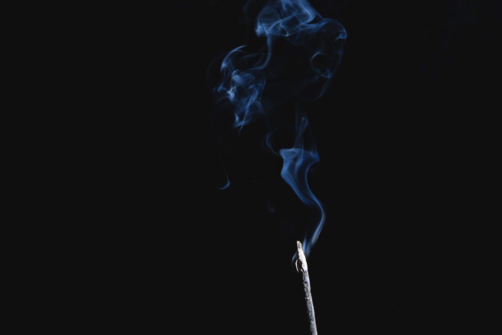
So as you may or may not have seen I did a smoke photo shoot. In this blog I will go through the set up I used to create my smoke photos. First things first, setting up the studio. 
Below shows my basic set up, I pinned some black paper to the wall and some more black paper to the sideboard (to prevent too much light bouncing back). Placing some white card to the side of the flash gun to direct the light in one place.


To set up the smoke I placed an incense stick between a paper clip, balancing it on the top of a bottle and lit it up. 


Next I set up my camera setting, for this shoot my settings were 
1/160
F/9
ISO 100
Once I had picked out my setting I focused my lens and switched my lens to manual (just because I didn't want to keep re-focusing the camera as it wastes time) this kind of shoot usually would work best if you used a tripod, though I shot mine without one. If you don't use a tripod it just means you have to try and not move the camera around too much.


I had noticed that some of my photos gave the smoke a blue tint, this was not edited in and I didn't intend for it t happen. Though I am rather happy with how those photos turned out, my guess was that my camera caught the flash in the photo turning the smoke blue. I'm not sure why it happened but I did notice that every time the camera pointed slightly toward the flash gun the smoke came out blue in the photos.